
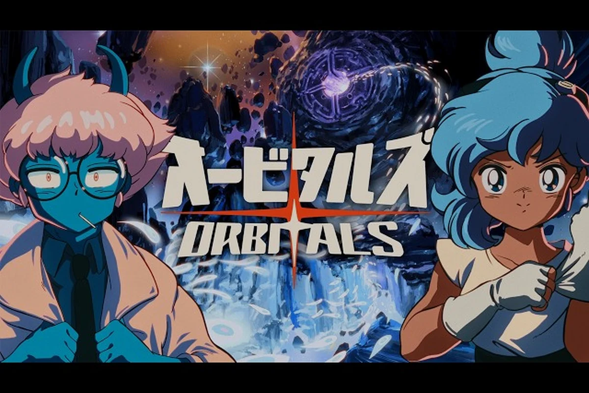
Orbitals concept art immediately signals a retro anime sensibility, with hand-drawn linework, saturated sci-fi color, and a tightly framed space station setting that feels equal parts cozy and high-stakes. Understanding the game's visual language helps players recognize story beats before the dialogue lands, and it gives the upcoming release on Nintendo Switch 2 a distinct identity within the crowded co-op adventure space.
What Orbitals Concept Art Reveals About the World
The concept art style is deliberately hand-drawn anime — a choice confirmed across the Orbitals official website and the Kepler Interactive publisher page, which describe a "lovingly crafted retro anime world." That phrasing is more than marketing. Every frame of the early materials leans into 1990s cel-shaded influences: exaggerated highlights, compact character silhouettes, and a warm-cool color split between the interior of the space station and the threatening void outside.
The Core Art Direction Pillars
| Pillar | Visual Treatment | Purpose in the Game |
|---|---|---|
| Linework | Variable-thickness black ink lines | Keeps character silhouettes readable during co-op puzzle sequences |
| Color Palette | Warm oranges + cool deep blues | Frames the station as a sanctuary against a hostile storm |
| Lighting | Rim-lit contours on Maki and Omura | Mimics theatrical stage lighting for cinematic cutscenes |
| Texture | Flat cel shading with limited gradients | Optimizes for Nintendo Switch 2 hardware without losing charm |
This combination is rare in modern co-op titles, where 3D realism dominates. The retro anime hook is part of the game's identity promise — players should expect something closer in spirit to a Studio Ghibli short than a photoreal space sim.
Character Design First Impressions
The two playable explorers, Maki and Omura, are drawn with exaggerated proportions and expressive eyes typical of the genre. According to the Wikipedia entry on Orbitals, they must work together to prevent a space station from being destroyed by a deadly storm. The art reflects that collaboration: character poses in the official materials often show them reaching toward each other or sharing a focal point, reinforcing the asymmetric co-op design from the very first frame.
Decoding the Orbitals Visual Style
The Orbitals visual style is not just "anime." It draws from a specific lineage — think Studio Massket influences, where the storytelling leans on camera angles, held glances, and clean staging rather than dialogue dumps. The result is an aesthetic that reads well in a paused trailer frame and in motion.
Color Theory and Mood Setting
Color drives mood in Orbitals more than in most puzzle-adventures. The trailer materials consistently use deep navy blues for the Storm Wall — a wall of cosmic weather that threatens the station — and golden amber tones for the safe interior zones. This binary creates a clear visual rule: warm equals safe, cool equals danger.
| Zone Type | Dominant Colors | Emotional Cue | Example Frame |
|---|---|---|---|
| Station Interior | Amber, peach, soft yellow | Safety, home, cooperation | Dining bay with warm overhead lights |
| Storm Wall | Navy, violet, white crackle | Threat, urgency, isolation | Exterior shots of swirling space debris |
| Tool Workstations | Muted teal + brushed metal | Problem-solving, focus | Puzzle consoles with glowing buttons |
| Cutscene Spotlight | Single warm key + dark falloff | Drama, revelation | Character close-ups during story beats |
Animation Choices That Sell the Style
The animation is intentionally limited-frame in the tradition of older anime, where a held pose with a subtle shift conveys more emotion than a dozen interpolated frames. Players who watch the Gameplay Reveal Trailer on YouTube will notice the characters move in distinct "key frames" with snappy transitions, rather than smooth fluid motion. This is a design choice, not a budget limitation — it keeps the world feeling illustrated rather than rendered.
The Orbitals Trailer Music and Sound Identity
Trailer music is a major part of why the Orbitals opening video feels like a small animated short. The main theme, titled "Accelerating Destiny," is described on the official site as a deliberate throwback to classic anime opening tracks. The composition layers synth pads, a driving drum machine pattern, and vocal hooks that nod to 1980s and 1990s anime OPs.
Trailer Score and Tone
| Trailer | Tone | Music Style | Linked Video |
|---|---|---|---|
| Announcement Trailer | Hopeful, introductory | Uplifting synth arpeggios + soft vocal | Watch on YouTube |
| Gameplay Reveal Trailer | Energetic, puzzle-focused | Driving beat + rhythmic keyboard stabs | Watch on YouTube |
| Release Date Trailer | Urgent, climactic | Full orchestra swell + rock-tinged chorus | Watch on YouTube |
Players who want the full track should check out the dedicated Orbitals original soundtrack page, which covers the main theme and additional BGM cues used across the campaign. That dedicated page also breaks down how the orchestral motifs from the Release Date Trailer — the same rock-tinged chorus cues you hear over climactic concept art reveals — are reused as leitmotifs during key story beats, so fans of the Orbitals visual style can trace how the trailer music maps onto full-mission ambience.
How Sound Reinforces the Visual Mood
The sound design is inseparable from the visuals. The Storm Wall does not just look threatening — it roars with low-frequency rumble and high-pitched static that mirrors the cool blue palette outside the station. Interior zones carry warm reverb tails, gentle ambient hums, and soft chimes when puzzles resolve. The result is an audio layer that is as carefully composed as the linework.
For a deeper look at how the voice acting and dub languages support this mood, the Orbitals intro song guide breaks down the background music and vocal themes that frame the opening cinematic — including how the leitmotif tied to the Storm Wall recurs as a whispered, almost subliminal hum in later puzzle rooms, and how the localized dubs re-pitch certain choir swells to match the cool blue palette of the exterior art direction.
Breaking Down the Orbitals Intro Cinematic
The intro cinematic is where every art pillar converges. It introduces Maki and Omura, establishes the Storm Wall threat, and sets up the cooperative premise — all in roughly 90 seconds of tightly edited footage. The intro is also a useful study in how Orbitals uses camera language to tell a co-op story visually.
The Three-Act Structure of the Intro
| Beat | Duration | Visual Focus | Sound Cue |
|---|---|---|---|
| Cold Open | 0:00 – 0:15 | Station exterior under calm skies | Soft synth pad |
| Inciting Incident | 0:15 – 0:45 | Storm Wall approaches, alarms trigger | Main theme kicks in |
| Call to Action | 0:45 – 1:30 | Maki and Omura gear up side by side | Music swells to chorus |
The pacing follows classic anime storytelling principles, and the Orbitals cinematic trailer leans hard into show-don't-tell. There is no rushed exposition or on-the-nose narration — the visuals carry the emotional weight, trusting the viewer to read Maki's quiet resolve in the way she shoulders her rig, Omura's nervous energy in his shifting stance, and the growing dread in the cold-blue rim lighting that swallows the Station as the Storm Wall closes in.
Recurring Visual Motifs
Several motifs repeat across the intro and concept art, forming a deliberate visual grammar that runs through the Orbitals cinematic trailer and opening video rather than appearing as isolated flourishes. Recurring shapes around the viewport, the hands of Maki and Omura, and the cracked station glass are all foreshadowed in early concept pieces and then amplified once the orbit gameplay begins.
-
The Window Frame — Almost every character moment is staged near a viewport, framing the characters against the void and reinforcing the "small human story in a vast universe" theme.
-
The Reaching Hand — Maki and Omura are often shown reaching toward each other or toward a shared tool, foreshadowing the asymmetric co-op design.
-
The Cracked Glass — Glimpses of damaged station panels hint at the ongoing threat and the ticking-clock pressure driving the narrative.
These motifs are deliberate choices in the Orbitals concept art, designed as a visual grammar that pays off across the full cinematic trailer and opening video rather than only registering in the opening minutes. Because the orbit gameplay loops back to the same viewport framing, reaching-hand compositions, and cracked station glass established in early concept pieces, players begin to read those shapes as emotional shorthand — a viewport signals vulnerability, a hand signals trust, a fracture signals the clock — so the visual language compounds over multiple hours of play instead of feeling like a one-time flourish.
How Concept Art Translates to In-Game Presentation
Concept art is not the same as final-game rendering, but in Orbitals the gap is narrow. The developers at Shapefarm have stated the goal of preserving the illustrated look in motion, which means the in-game camera frequently lingers on wide shots and character close-ups that showcase the linework rather than hiding it.
Cinematic Trailer vs. Gameplay Footage
| Aspect | Cinematic Trailer | Gameplay Footage |
|---|---|---|
| Frame Rate Feel | Stylized, held poses | Smooth but slightly stylized |
| Camera Behavior | Slow pans, dramatic dolly-ins | Following camera, occasional cuts |
| Color Saturation | Highly saturated for poster appeal | Slightly muted to reduce eye strain |
| Particle Effects | Hand-drawn style sparkles | Cel-shaded glows and dust |
A full Orbitals trailer analysis is available for players who want to compare footage side by side, but the short version is that the cinematic trailer is not a bait-and-switch — it is a faithful preview of how the game actually looks during play.
Pre-Order and Release Visual Materials
The Nintendo eShop listing for Orbitals confirms the release date of September 3, 2026, at a $39.99 price point, and the box art and pre-order trailers carry the same visual identity as the concept work. There is no jarring shift from "marketing art" to "actual game" — a common frustration in the genre that Orbitals appears to have designed around.
Frequently Asked Questions
What is the art style of Orbitals concept art?
Orbitals concept art uses a hand-drawn retro anime style with variable-thickness ink lines, cel shading, and a warm-cool color split between safe interior zones and the threatening Storm Wall. The approach is confirmed by the Kepler Interactive publisher page and reflects 1990s anime influences rather than photoreal 3D rendering.
Who are the two main characters shown in the concept art?
The two main characters are Maki and Omura, space explorers who must cooperate to save their station from the Storm Wall. According to community data, their character designs emphasize exaggerated proportions, expressive eyes, and poses that reinforce the cooperative theme.
What music is used in the Orbitals cinematic trailer?
The Orbitals cinematic trailer features the main theme "Accelerating Destiny," which layers synth pads, driving drum machine patterns, and vocal hooks inspired by classic 1980s and 1990s anime opening tracks. The official website describes it as a deliberate throwback to that era of animation.
Where can I watch the Orbitals opening video?
The opening video appears in all three official trailers published on the Shapefarm YouTube channel: the Announcement Trailer, the Gameplay Reveal Trailer, and the Release Date Trailer. The intro cinematic also plays in-game once players boot up the title on Nintendo Switch 2.
Will the final game match the look of the concept art?
Based on community data and developer statements, the final game preserves the illustrated look of the concept art in motion, including variable linework, cel shading, and the warm-cool color palette. The cinematic trailer is widely considered a faithful preview of in-game presentation rather than a stylized marketing piece.